Painting with light
When we think of painting with light we think primarily of the Impressionists who tried to capture light as it played with the forms of the landscape - the ever-changing light making the subject take on a different feel and atmosphere.
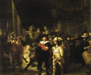
But centuries before artists such as Caravaggio were using dramatic lighting to create mood and aura through chiaroscuro. Rembrant, strongly influenced by Caravaggio, was also a master of light and shade.
 CaravaggioSaint Catherine of Alexandria (c 1598)Oil on canvasRembrandt,The Company of Captain Frans Banning Cocq, known as The Night Watch (1642)Oil on canvas


A contemporary of Rembrandt, Harmen Steenwyck, produced a work The Vanities of Human Life (1645) which vividly captures light pouring through the window drawing the eye to a rather macabre still life ...
Since then there have been so many who have used light in this way, but these artists were groundbreaking in their time. It is always the paintings that use light in fantastic ways that appeal to me. Mark Rothko created mood with colour and light, or in the case of his dark paintings such as those in the Rothko chapel in Houston, an absence of light.
This is The Ochre (Ochre and Red on Red) 1954
Oil on Canvas.
 Strangely Rothko preferred to paint in the relative gloom of electric light - he blacked out the windows in his studio. He created huge canvasses that would envelop the viewer, visible in their entirety only by turning. This was typical of the New York School, where large-scale canvasses were the norm. You only have to visit the Musee D'Orsay to see that large canvasses have always had a monumental effect on the viewer. But whereas the battle scenes of yesteryear told an epic story these paintings convey weighty emotion. I recently saw an exhibition at the Serpentine Gallery - Ellsworth Kelly's recent works - one in particular reminded me of Rothko because of the choice of colours as much as the use of rectangular blocks of colour.
In the 1950s Kelly was working in Paris and unaware of what Rothko was doing in America, and Kelly's work is hard-edged where Rothko's is soft and ephemeral with a translucence and luminosity that Kelly's does not have. Yet Kelly felt close to Rothko and admired his work for its "presence, just pure abstraction". I agree with him when he says, "When I think about Rothko, it's color first, the exuberance, the luminosity, and the radiance of color that is so striking. I'm not much interested in his dark paintings." In an interview with Mark Rosenthal in 1997 Kelly goes on to say, "The work seems to glow. It looks very healthy and has a strong presence." (Taken from the exhibition catalogue from the National Gallery of Art, Washington, 1998 isbn 0-300-08193-6)
It is this warmth and feeling of well being that is so important to me. The effect is the same as with light, in stained glass etc. I am not going to be looking at the Impressionists, whose work is wonderful in its own way, but not what interests me personally...
Coming soon - colourscape...
An aside...
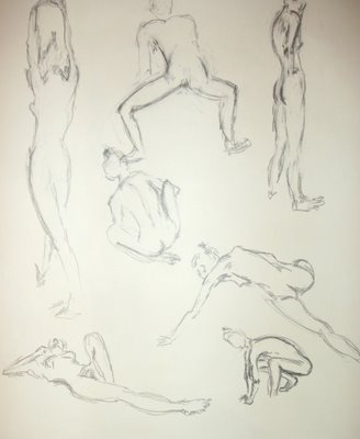
 Over the past three days I have been drawing continuously - as part of a workshop run by Bill Prosser. It has been exciting and exhausting in equal measure!
It doesn't have any particular relevance to this blog, but there must be some similarities in approach or outcome, and if not, never mind...
Here are some images from the last two days in no particular order - some of them were two minute poses, some slightly more...


I drew this figure entirely with the word 'taste' - an exercise to respond to a particular word - trying to key into my handwriting as a drawing style by concentrating on text and using it to create shadows and lines - I rather liked this outcome. I think the word association worked for me on a couple of levels - it allowed me to work more expressively and more subjectively.
This exercise of folding the paper and placing the figure into the different sections was another way of formalising the drawing - however, instead of keeping the figure within the confined area, I made it break the boundary, then placed another figure very close, then overlapped the figures - progressively more related and entwined - some interesting relationships occurred - I don't think they show particularly well in this photo however. I'll try some close-ups...


 Strangely Rothko preferred to paint in the relative gloom of electric light - he blacked out the windows in his studio. He created huge canvasses that would envelop the viewer, visible in their entirety only by turning. This was typical of the New York School, where large-scale canvasses were the norm. You only have to visit the Musee D'Orsay to see that large canvasses have always had a monumental effect on the viewer. But whereas the battle scenes of yesteryear told an epic story these paintings convey weighty emotion. I recently saw an exhibition at the Serpentine Gallery - Ellsworth Kelly's recent works - one in particular reminded me of Rothko because of the choice of colours as much as the use of rectangular blocks of colour.


