John Piper and Stained Glass
OK, I've just lost everything that I have been posting for the past hour - extremely frustrating, especially as I may not remember my exact thoughts and feelings, but here goes...
John Piper started creating stained glass windows in the 1950s - he did not actually make the windows himself, but painted the 'cartoons' from which the stained glass maker worked.
The first one here is the West Window from St Paul's in Bledlow Ridge created in 1968, which is quite near to me so I must try to see it. In this " he has let his designs run right across the mullions from one light to another. It is a rhapsody in many shades of blue." [John Piper and Stained Glass, by June Osborne, 1997, Stroud: Sutton Publishers, 0-7509-1088-7]

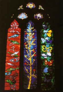
This is the East Window of St Bartholomew's in Nettlebed, 1970.

Below are two examples of windows from Eton College Chapel: The Raising of Lazarus and the lower half of The Light under a Bushel.

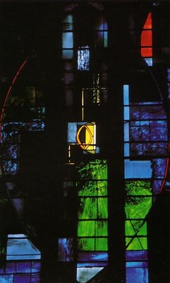 Although all the windows are exquisite I find that the top one - the West Window at St Paul's - is the most emotive. Even looking at the printed image I am enthralled by the "rhapsody of many shades of blue". Of course on the computer screen these images look even more stunning than in print, but still not approaching their beauty when light is streaming through.
Light is a very powerful agent - the colours and images of stained glass windows were used to imbue churches with spiritual qualities. Today abstract images are often used in place of representational religious scenes, but personally I think the spiritual quality lies in the use of colour and light more than the imagery.
Piper uses much more blue in his work than other colours. I wonder, if red and orange were used almost exclusively, would the result be overpowering? In western culture at least, blue is viewed as a colour of calm, reflection, spirituality, whereas red and orange are very activating colours - more likely to be used when energy and activity is to be encouraged. I'd like to try using those colours and see what difference they make to mood.
Light is now used quite widely in the treatment of Seasonal Affective Disorder ( a form of depression attributed to the lack of light in winter, particularly in northern climates where the days are very short). I have long felt that light is very therapeutic and that coloured light can hugely affect mood and wellbeing. This is an area that I should like to look at in more depth, possibly by creating a space with variable light and colour...
Many fine artists have worked with stained glass - perhaps for the same reasons that I am drawn to it: the intense colours and feel of a piece when light is added, and the beauty of translucent materials. Henri Matisse, Fernand Leger, Georges Rouault, Georges Braque, and Marc Chagall were all attracted to stained glass, and probably many more that I haven't found yet.
I also see a parallel with stage lighting. The way that light can be mixed on stage to create any mood required for the production is fantastic and may point the way for me with my 'mood room'. Hockney, for one, is a fine artist who designed stage sets - one I can remember bathes the stage in blue - the Mikado maybe? I must look into that for next time...
Albers created these over 80 years ago

Josef Albers
Rhenish Legend, 1921
Assemblage, glass and copper.
Josef Albers
Park, 1924,
Glass, wire, metal and paint in a wooden frame.

Rhenish Legend (currently on display at Tate Modern, Albers and Moholy-Nagy, From the Bauhaus to the New World) is an example of an early abstract piece by Albers - he found the glass by scouring the streets of Weimar for broken bottles and windows. This work and others like it are called Scherbenbilder, or shard pictures, and are entirely consistent with the Bauhaus ideals of light and transparency. Likely influences on Albers were Johannes Itten (teacher at the Bauhaus) and the Dutch glass-artist Johan Thorn-Prikker. Albers studied with him in Essen and learnt how to make stained glass windows.
Albers was not just interested in glass as windows, however. He found reflection as important as transparency, and began using opaque glass.
To quote Michael White from the exhibition catalogue, "The common link from Albers' assemblages of the early 1920s to the sandblasted works is the mutual interplay between rough and smooth, opacity and translucency, reflection and dullness."
I should like to incorporate these qualities into my own work - I can sandblast panes of coloured and/or opaque glass, with my own designs. The first thing is to find a supply - back to the internet...
A short movie - my first!
I have posted a very short (appallingly taken) movie using a projector with rotating colour wheel on the youtube site - accessed from http://www.youtube.com/watch?v=qese22BLcXk .
I tried embedding the movie into this site and everything went haywire, so it's shown here via the link instead.
Light is projected through glass that has been sandblasted to make it opaque in parts. The clear line was preserved by masking the glass using a technique of applying pva glue in an organic fluid line. This is the first piece of glass that I have worked with, but I plan to make more!
Yesterday I saw the Albers and Moholy-Nagy exhibition at Tate Modern and am now inspired to create more pieces of glass after Albers' style.
 Joseph Albers
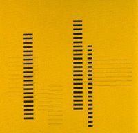
Skyscrapers on Transparent Yellow
circa 1929
Sandblasted flashed glass
36.2 x 36.2 cm

Joseph Albers
Skyscrapers B
circa 1929
Sandblasted flashed glass
36.2 x 36.2 cm
I have always been interested in juxtaposing matt and glossy surfaces and the way that Albers achieved this with opaque glass is wonderful. The glass has more luminence than other surfaces and so the glossy section is extremely reflective and more of a foil for the matt finish. I don't know how he achieved the white lines, can anyone else help me? A piece that showed this very strongly is Glove Stretchers 1928. Here is my sketch of the piece:

There were many exhibits that I found pertinent to my Self Initiated Project on trace - these may find their way on to my blog on trace eventually, but one piece by Laszlo Moholy-Nagy was appropriate for here:
Light Prop for an Electric Stage, 1928 - 30 (replica 1970)
Metal, plastic and wood
Spotlights are trained upon the piece that Moholy-Nagy called a moving painting to cast deep shadows on the floor and the walls. There are sharp points of light also, where the light bounces off the reflective surfaces of the metal. He created this piece almost 80 years ago - I find that quite aweinspiring!


 Although all the windows are exquisite I find that the top one - the West Window at St Paul's - is the most emotive. Even looking at the printed image I am enthralled by the "rhapsody of many shades of blue". Of course on the computer screen these images look even more stunning than in print, but still not approaching their beauty when light is streaming through.