An investigation into the use of light in art from stained glass windows to fluorescent tubes

Monday, March 12, 2007

Help for new visitors!

If you'd like to follow in time sequence please use the Archive links bottom right to click and link to the appropriate pages.
Otherwise read on... from the evaluation backwards...
Lots of images are posted throughout but this first bit is rather wordy!
Please make comments if you'd like to

More recent work at http://illuminatingcolour.blogspot.com

Wednesday, June 14, 2006

Observations following my presentation...

Following the presentation of this module today just a few more observations/reflections…

Light will continue to be something I am interested in and drawn to and I may well make some work with it – Stewart you are right when you say I need to just consider things and wait for the right idea to come. This considered way of working is something that sits well with me, and making small samples of work inspired by other artists might just trigger something bigger.

I also like using multiples – looking back over my work I have seen a tendency to work with repeat images – not the same but nearly so, just enough different to ask the question. This too is an idea to carry forward – it will even figure in my SIP in a small way.

With reference to Stewart’s question on how do I classify craft? When I referred to materials/techniques being downgraded from fine art to craft I was influenced by two things, I think. First my observation of how artists pounce on new technologies, try them out, and almost use them up and throw them away. Some technologies remain, but not always in the manner they were first used. A new medium in art can be a new technique and that technique can be used by fine artists as well as other creative people or craftsmen. I wonder if fine artists sometimes disdain materials or techniques when their use has become widespread? Secondly I recognise there is a prevalent feeling that craft is not as worthy as fine art – I do not agree with this and think that how one discipline is rated beside another is somewhat to do with fashion – things go in and out of fashion –for example the use of pattern – once a dirty word but now being reinvented by some fine artists. So how do I classify craft? Perhaps it is something for which there is another use over and above the visual experience? That is, glassware/ceramics made to be used not displayed, textiles produced to be worn, not hung on the wall, graphical arts used to sell an idea? I’m not sure, but these are my first thoughts. I’ll continue to re-evaluate this.

Re my four classifications of light – this may be explained better on my blog than I conveyed today – I think I may have got a little muddled!
Reflection – light falling upon a surface and being reflected
Projection – where a light source is projected towards an object such as Miss Understood and Mr Meanor, and therefore projected away from the viewer
Light passing through – where light from the sun or an artificial light source passes through a substance eg stained glass, perforated paper
Radiating light – I shall use this word instead of emanating which may have other connotations and I mean it to refer to those works with an integral light source such as David Bachelor’s Candelabra 3 or Dan Flavin’s fluorescent tubes.

These classifications are something I have very recently defined for myself to understand what it is I most admire in some works and not in others - there may be more – I’ll keep an open mind! Both light passing through and radiating light create a strong reaction in me, whereas reflection and projection I can appreciate but not feel so much for. I also think that radiating light and light passing through somehow involve the viewer more, and that appeals to me – I want to involve the viewer in my own work too.

Monday, June 12, 2006

Conclusions on Light in Art from a very personal point of view

Over the last 5 months I have looked at the use of light in art. It is a huge subject since light has played an integral part in the art of many cultures over the millenia. Here, at the risk of being too wordy, are my thoughts on how light plays a vital part in art and what, for me, is the most successful.

As I try to draw conclusions from my thoughts on light in art I realise how many omissions there are in this log.

Some omissions are deliberate because they are not relevant, or I do not wish to focus on them, some I do not have room for and some may be oversight…

Light is the basis of life on Earth so it has always been special/spiritual. The Egyptians thought of the Sun as the eye of the god Ra, ‘Everywhere among the remnants of ancient Egypt are hints of this fundamental awareness of light – materials that attract and reflect the sun, luminous surfaces that gleam, glitter, glow, shine. Obelisks were capped in gold and some were completely sheathed with it.’ [pg 9 Hess & Ashbery, Light: From Aten to Laser – see bibliography]. They faced the pyramids in white limestone and angled the faces so that ‘on the shortest, darkest day of the year, when the sun was weakest, lowest in the sky, and might seem to be dying, the pyramids were at their brightest, gleaming like mirrors held up to the sky’. [p17 Hess & Ashbery]

In early Christian art gold is conceived as light materialised. Mosaics used optical devices – squinches, pendentures and curved surfaces – to increase the quantity of light.

Stained glass has been used for centuries in churches/cathedrals to imbue the space with spiritual qualities and instil reverence in the congregation. Today abstract images are often used in place of narratives – I feel the spiritual quality lies in the use of colour and light more than the imagery. John Piper started creating stained glass windows in the 1950s. Matisse, Leger, Rouault, Braque, Chagall and Albers have all been drawn to stained glass.

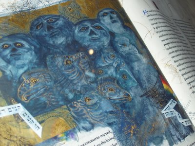
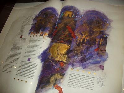
There seems to be an interrelationship between stained glass and illuminated manuscripts – sample sheets from the Saint John’s Bible currently being produced were on display at the V&A recently, and I was reminded very much of stained glass windows.

Piper’s design for the West Window at St Paul’s in Bledlow Ridge is a rhapsody in many shades of blue – I was reminded of Hockney’s stage sets for The Rake’s Progress that were bathed in blue light giving a surreal look to the fantasy setting.

Da Vinci then later Caravaggio and Rembrandt moderated their colours to create drama through contrast in tone – chiaroscuro. Turner used light in a completely different way whilst the Impressionists were intrigued by the changing light playing across their subjects. Post World War II American artists incorporated light in their work. The Ellsworth Kelly exhibition at the Serpentine Gallery had one piece in particular that seemed to emit light in a way that some of Mark Rothko’s works do.

Eighty years ago Albers and Moholy-Nagy were using light and reflective surfaces – their recent exhibition at Tate Modern showed their fascination with new technologies – whilst at the Bauhaus they were able to experiment with many processes. These same skills have now become more craft than fine art, just as the making of stained glass windows has.

When a technology is new artists pounce on it and use it in their art. When it has become commonplace then its use is relegated to the status of craft. Despite this I wanted to experiment with some of the same techniques and so I created some glass tiles after Albers, sandblasting them and using pva glue to mask where I wanted to preserve the transparency..

More recently there has been a plethora of artists that have dabbled in light - for example: artists using neon lights and text [Bruce Nauman, Cerith Wyn Evans, Tracey Emin], artists who use the radiance of light [Angela Bulloch, Liam Gillick] and artists who project light [Tim Noble & Sue Webster].

I think that I can classify works using actual light, as opposed to light in painting, in four different categories:

Reflection Richard Long’s 20:50 sump oil installation from 1987, James Turrell’s early work using deflected light.
Projection Tim Noble & Sue Webster’s Miss Understood and Mr Meanor.
Light passing through Albers’ light boxes
Emitting light Dan Flavin’s and Richard Box’s fluorescent tubes, David Bachelor’s glowing bottles and screens.
I think, at a stretch, I may be allowed to include Walter de Maria’s Lightning Field – his intervention in the landscape – in this last category.

For me the real difference is between those works that emanate light towards the viewer, bathing us/immersing us in light, and those where the light is projected away from the viewer. The latter seem flat and uninteresting by comparison.

Outstanding for me was the Dan Flavin exhibition at the Hayward Gallery, where on entry the viewer was confronted by a network of green fluorescent tubes. I sat down, back against the wall to drink it in. As I sat there the ‘greenness’ of it became less and less as my eyes (or rather brain) adjusted to the light. The white stair lights shone mauve, which I believe is the complementary to the green. As I walked around I became obsessed by staring at the neon lights then closing my eyes to see the complementary coloured after image. Seeing all those works together made such an impact and allowed me to truly appreciate Flavin’s art.

At the same time there was an exhibition called Backdrop in the Bloomberg Space. Outstanding amongst these was Candelabra 3 by David Bachelor, where he had used 500 recycled plastic bottles, each lit by a single bulb.

The brightness of objects is all relative. At midnight a handkerchief looks white but it emits very much less light than the same handkerchief at noon. The observed brightness of an object depends upon the distribution of brightness across the visual field.

To achieve the sensation of ‘glow’ an object must possess a brightness value well above the scale established by the rest of the field.

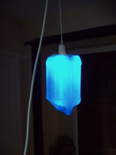
My bottle lights glow – they glow even in daylight, but especially so in the dark. I am not a fan of works being large for the sake of it, but this is one case where scale is vital. Bachelor’s work succeeds because he gathers 500 lights like my example, and they span two floors in a perfect atrium setting.

Richard Box’s Field of 1301 fluorescent tubes works because of scale. Even if my tube had lit up when I planted it next to the electrical substation it would have been puny in the extreme.

Bachelor talks of wanting to ‘transport’ the viewer by immersing him in the light and hue generated by his works – he likens it to cinema or a musical composition where viewers are held enthralled, involved in the event.

That is the quality I most admire in all these works.

Hockney Paints the Stage

Somehow or other I find I completely omitted to post this on Stage Lighting with particular reference to Hockney, so here it is now...

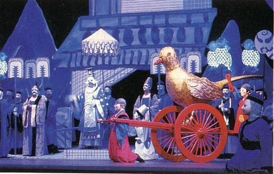
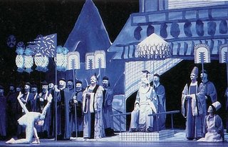
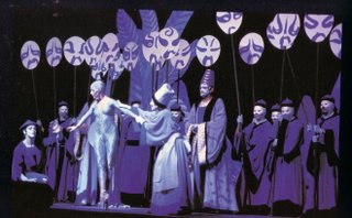
Hockney, like many other artists, saw the potential for creating art with light for the stage. Light creates mood, changes pace in a scene, directs the audience's attention and allows one stage set to serve many purposes.

The use here of blue lighting on a stage set that is rather crudely drawn and painted gives an 'unreal' look. The actors are wearing masks - these are echoed in the use of larger symbolic masks held above the actors' heads, all of which creates a 'surreal' situation. We are being asked to follow along with an elaborate fantasy or game, rather than immerse ourselves in a real life drama.

Mixing light on stage is a perfected art - various handbooks and manuals have been written to help designers and technicians achieve the colour for the mood but there is great potential for using art to send subliminal messages by creating the right environment, as Hockney showed.


Reflections on the Blogger experience

I feel fortunate that I have come through the blogging experience relatively unscathed!

From the start I was afraid that I should become addicted to blogging and that I would have repetitive strain injury, deteriorating vision, tension in the shoulders and worse... Having spent many years working with computers I was resistant to their use for something that I feel should be much more autographic but I suppose there is a certain tactile quality to hitting the keys and typing out my thoughts for the day!

Actually this has been very useful since it does force me to make regular entries in the blog, as opposed to the logbook - I'm sure I'm not the only one to catch up on several weeks at a time with the latter. There is no hiding with the blog since the dates tell their own story, although I have noticed it is possible to make a very short entry then go back to edit it/fill it out later!

Of course the greatest advantage is that my mentor, Dale, and fellow students (and a few randoms) have been able to read about my investigation and make pertinent comments. This has been a fantastic way of gaining feedback and suggestions for further research. Also when I read a comment it is very easy to immediately do a search on the net and find the new point of interest.

At the start we had discussions about which module the blog would fit most easily into - I have thought about this quite a lot, since my Self Initiated Project may have benefitted from its inclusion and the balance of time spent blogging v creating work might have been better. I still think CCofD was probably right overall because there is no requirement for our own work in this module, featuring, as it does, research in the historical and cultural contexts of our work. If we had included it in the SIP I wonder if it would have been more difficult to switch between the hands on work and the computer based reflection?

Bloggin has become, if not second nature, at least comfortable for the most part - reservations only because it is sometimes very busy and posting images is impossible - then I resent the time lost and still no images.

Creating the bibliography online was difficult because of the limted formatting, and sometimes, just sometimes, the size of text etc seems to be completely *****d. Reading the blog from scratch (say, as the tutor?) must be a nightmare... so much information to wade through and in reverse order - so counter intuitive. Good luck Stewart!

Finally, the greatest advantage - I have really enjoyed the insight into what the rest of the group has been doing and to be able to give my two-penneth as well!!!

Sunday, June 11, 2006

Pics of my bottle lights


Big Blogger had been having problems with posting my images again - not all of them, just the ones I really want to post of course. Here at last are a couple of pics of my bleach bottle light...

The Saint John's Bible


Back in March I visited the V&A Museum to see the Illuminated Bible - sample pages are on view and the history of the making of this contemporary illuminated work is outlined.

The luminence achieved by the illustrators is superb - you can view it by going to the V&A's website

http://www.vam.ac.uk/collections/prints_books/saintjohnsbible/index.html

or at the Saint John's website

http://www.saintjohnsbible.org/

I took some photos myself... don't you think they recreate stained glass beautifully?


Friday, June 09, 2006

Bottle lights


Making lights from recycled plastic bottles...

David Bachelor made a fantastic chandelier for the Bloomberg Space - featured earlier on in this blog. I wanted to make one for myself to see the glow. Bachelor used 500 empty plastic containers of various sizes and colours - none of the literature says what kind of light he used, but I think each bottle had a pendant light with regular bulb and a very long flex that wound around a column and was plugged into a huge bank of power points on the floor. The whole thing was two stories high, maybe three including the space beneath.

This is a drawing from my sketchbook that shows how it was installed...

So I wished to make something for myself - I have been saving bottles for months now and it has become clear to me that only a very few are perfect for creating light fittings. Most are too dense and therefore opaque, or, more likely, too thin and therefore allow too much light and do not give the 'glow'.

Then there's the kind of light to use - I have tried fibre optics (too feeble), fairy lights (also too feeble except in one case where they worked well), ordinary bulbs (too hot), and finally settled on a low wattage candle bulb as shown in a previous post with the unsuccessful green bottle.

Finally I emptied a huge bottle of bleach and set about making another light - hurrah, success - the right amount of 'glow' and no problems with over heating etc. Here it is... [Oh no it isn't... Blogger won't let me post just now! I'll try again at another time, perhaps Blogger is suffering from heat exhaustion!]

Now obviously the effect that Bachelor achieved is much greater, more impressive than my one light, but it is, I think, in direct proportion to the number of bottles used. I am not always an advocate of size - in fact sometimes I think that making large works is a cop out because anything can look impressive with scale, but in this case the size is absolutely vital. I am happy to have made one light and do not need to create a larger piece, after all it is David Bachelor's idea not mine (and it would be hugely expensive), but I found it satisfying.

Next I turned back to the set of fairy lights that I had found for 50p in the Charity shop in Cushendall... Very small probiotic yogurt pots with the plastic labelling still applied did the trick - again lots of trial and error before finding this particular type. And this time very cheap!!!

An electrifying experience

So armed with a fluorescent tube and a box full of low voltage long life bulbs I went in search of a significant electrical field to try to witness them powered by the electricity in the air.

I remembered years ago seeing a huge sub-station a few miles away - can you believe that back then the school children used to go to a woodland learning centre that was sited right next to this station? This sub-station is so large that it is shown on the Multimap section for the area. So my son and I set off in search of it.

Of course the actual station is off limits but there is a footpath that skirts round it - so we tramped through the beautiful woodland towards the pylons that were clearly visible. We were able to approach amazingly close to this place, where death warnings were posted all along the fence.

The sound of so much electricity being fed along the power lines was deafening and my whole body was tingling - not sure if my hair was standing on end but it could have been!

We 'planted' my small fluorescent bulb under some of the power cables to see if it would light up, but sadly it didn't. There are so many potential reasons why this did not happen - the end of the bulb was not in close enough contact with the ground, the tube was not long enough to create the right conditions, the huge power source in the station was setting up multi directional electrical fields, the ground itself may have been charged so there was no potential difference between overhead and the ground....

Faced with so many variables we could not find a suitable solution - I have emailed Richard Box to see if he is willing to share his knowledge and help me track the right conditions.

Everything about that experience was electrifying and very scary. The fluorescent bulb itself is dangerous because the longer it is the more fragile and it is filled with carcinogenic material.

I may not wish to follow up with this, but I'll see if Richard can help.

These images may show the nature of the place...


How puny is this? And it didn't even light up!!!

Tuesday, June 06, 2006

Bibliography

The actual list of references would be huge but these are the most important sources of my research.

Borchardt-Hume, Achim, Albers and Moholy-Nagy, From the Bauhaus to the New World, 2006, London: Tate Publishing, 1-85437-638-1

Butterfield, Jan, The Art of Light and Space, 1993, New York: Abbeville Press, 1-55859-272-5

Friedman, Martin, Hockney Paints the Stage, 1983, London: Thames & Hudson, 0-7287-0447-1

Govan, Michael & Bell, Tiffany, Dan Flavin: A Retrospective, 2004, New York: Dia Art Foundation, 0-944521-50-9

Hess, Thomas B & Ashbery, John (ed), Light: From Aten to Laser, 1969, New York: The Macmillan Company

Keller, Max, Light Fantastic, 1999, Munich, London, New York: Prestel Verlag, 3-7913-2162-5

Nesbitt, Judith & Watkins, Jonathan , Days Like These, Tate Triennial Exhibition of Contemporary British Art, 2003, London: Tate Publishing, 1-85437-437-5

Osborne, June, John Piper and Stained Glass, 1997, Stroud: Sutton Publishers, 0-7509-1088-7

Pilbrow, Richard, Stage Lighting, 1970, Great Britain: Studio Vista Ltd, 0-289-79763-2

Rothko, Mark, Exhibition catalogue from the National Gallery of Art, 1998, Washington: National Gallery of Art , 0-300-08193-6


Wilmerding, John, American Light, 1980,Washington: Harpers & Row, 0-06-438940-5

Wolff, John, Light Fantastic, 1977, London: Bergstrom + Boyle Books Limited, 0-903767-17-1

Some of the websites accessed:

http://www.mudam.lu/shrigley/shrigley_on-off.htm, David Shrigley , Artist website
http://ledartist.com/index.html, Teddy Lo, Online led art
http://www.gasworks.org.uk/varts/iva_nav/, Ivan Navarro, Gasworks exhibition
http://www.saatchi-gallery.co.uk/artists/ivan_navarro.htm, Ivan Navarro, Saatchi Gallery
www.zen54564.zen.co.uk/r/press.htm, Richard Box, Artist website
http://www.pureenergysystems.com/news/exclusive/wireless_transformer/index.html, Pure Energy Systems Network Inc., Organisation fostering renewable energy
http://www.colourscape.org.uk, Colourscape Org, An experience of coloured rooms and light http://www.hayward.org.uk/, Hayward Gallery, Dan Flavin exhibition
http://about.bloomberg.com/about/ourco/space/index.html, Bloomberg Space, Backdrop exhibition including David Bachelor’s Candelabra 3
http://bovardstudio.com/gallery/contemporary.aspx, Bovard Studio, Stained Glass Maker’s studio with sample images
http://www.vam.ac.uk/collections/prints_books/saintjohnsbible/index.html
, V&A Museum, St Johns Illuminated Bible http://www.saintjohnsbible.org/

http://www.mi.sanu.ac.yu/vismath/russ/index.html, Irene Rousseau, Thesis: Spectral Light as Sculptured Space

http://www.whitecube.com/html/artists/cee/cee_frset.html, Cerith Wyn Evans at White Cube Gallery


Key exhibitions visited with reference to light...


Dan Flavin, 19 January – 2 April 2006, Hayward Gallery

Backdrop, 20 January – 18 March 2006, Bloomberg Space

The St John's Bible, 31 January - 1 May 2006, V&A Museum

Paul Hosking: New Works, March 2006, Fred [London] Ltd

Ellsworth Kelly, 18 March - 21 May 2006 , The Serpentine Gallery

Albers and Moholy-Nagy Exhibition, 9 March – 4 June 2006, Tate Modern


Still some things to do...

Not sure how much of my TO DO list I'll manage to finish...

I want to make a set of bottle lights out of a string of 'fairy' lights I found in a charity shop, plant some flourescent bulbs in a field beneath an electric substation a few miles away - for this I need company, not something I want to do alone in the dark, and also use the dozens of green bottles that I have collected to create something interesting that light can pass through - a window? a screen? not sure yet....

Then I wanted to use deflected light to create a colour field in semi-darkness - all a bit ambitious really for such a small module as Cultural Context of Drawing, but whatever I can accomplish in the remaining week will be enough.

Monday, May 22, 2006

Experiments with projection

I've been reading about James Turrell's works where he deflects or filters light, either natural or artificial and imbues a white space with colour. Unfortunately I've never seen any of his work - I intend to go to the Yorkshire Sculpture Park to see his newly commissioned work - it used to be a Deer shelter I believe.

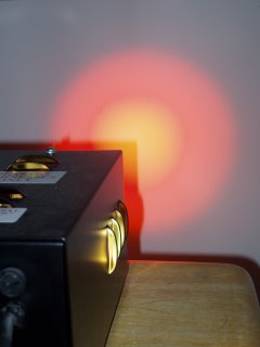
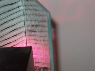
I have a colour wheel projector that I have used to project light through a piece of glass that I have sandblasted, and to deflect light via a mirror, also sandblasted.

This link is to my projection movie - it's only 16 seconds, but it shows the cycle of colours as the wheel turns http://www.youtube.com/watch?v=kkaZwaNEvys.

The effects are not amazing, but the resultant light has a diffused, disorientating quality about it. The images below are taken of the projection - reflected/deflected light is more difficult to photograph since it relies more on visual perception than actual colour.

To see this work best I need to find a room, painted white, with no natural light - that'll be the 'black hole' at Kingston then! It would be fantastic to achieve some kind of spiritual feel as Turrell does, although his is on a much larger scale of course!